kinetic/expressive type

Created by: David Carson
This is a good example because it combines multiple techniques to get a point across but doesn't over do it to the point that your not able to grasp the concept. I think one of the most successful concepts is the light against the dark. ANother thing that draws my eye to it is that a lot of the black is created by overlapped words which I thought was really interesting and I also think that creating space between the letters was really successful.

Created by:Anush shaginian
This is a good example because it is simple and easy to read but the concept is still really strong and presents a nice visual
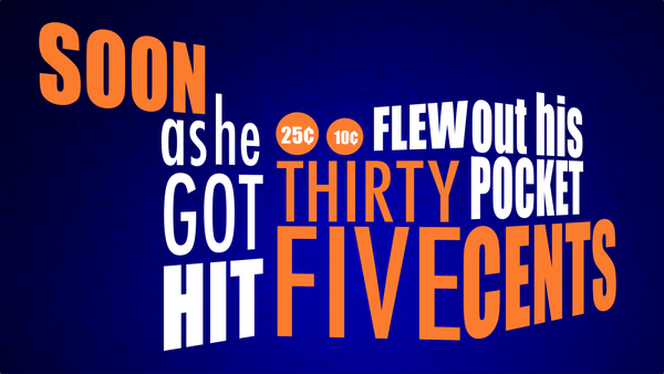
I like this example of kinetic type because of the variations of thick and thin as well as the scale of the words. I like that he put the 25 and 10 cents in circles in addition to writing out five cents to echo the way change looks I also like the way it helps gives a sense of motion with using depth of space.
No comments:
Post a Comment