Wednesday, April 3, 2013
Erik Spiekermann
I think his view on web design and print design is interesting. i think he has a unique perspective because he doesn't really care about the medium and says design is design. I also thought it was interesting how he compared a mobile phone to a small piece of paper. I think its really interesting to see his perspective of how things happened before we had a lot of the technology we do today. I like how he talks about color and how they didn't used to use it and just because we have access to it doesn't matter. a good point he makes is that no matter what the medium is you have to remember to make it easy for the audience to see what they need to see. I thought it was interesting that he works from smallest thing and then goes to the next biggest thing and compares that to web designer techniques. I also thought it was cool how open Erik was to people using his font in a way he didn't imagine and being able to appreciate it if ti looks good.
Monday, March 25, 2013
Jessica Hische/ Louise Fili
Jessica Hische-I thought it was interesting that she started creating type because she couldn't afford to get type that was already made. I also thought it was interesting that she did everything in illustrator because that is what I mainly use. It was also interesting how she brought up how legibility is a problem even when you think its not.I also liked how she compared and contrasted Graphic design.I also thought it was interesting that you can decide what an alphabet is going to look like by making 3 or four letters in lowercase. I also thought it was interesting how she didn't do anything for free unless it was for charity.
Louise Fili- I think a lot of her stuff is interesting. I like how she uses patterns to create type like with the tile.I like the type thats on the wine bottles she created. I think they're playful but still elegant and different from what most type for bottles look like. I like her style because it seems very clean and simple.
Louise Fili- I think a lot of her stuff is interesting. I like how she uses patterns to create type like with the tile.I like the type thats on the wine bottles she created. I think they're playful but still elegant and different from what most type for bottles look like. I like her style because it seems very clean and simple.
Tuesday, March 12, 2013

Chip Kidd
I think he was a really interesting because he's not like most people and its cool to see how he thinks. I really liked his book cover that made it seem like the type was running, I tried it on my cover to see if i could make it look like the things on my page were actual tears but it did not turn out so well. The Jurassic book cover inspired one of my designs to push the tiger to a more creative form instead of what people normally see. To book designers responsibility three fold to reader, publisher, and Author. I think that the budah spine design was really clever to prompt people to buy all of the books to see the life of the budah. I also like on how intrigue and murder among 16th century Ottoman court painters that he took the time to explain how the story is on the cover and how its suppose to keep you intrigued and show you a little bit more the further you pull it out of the shelf. the John updike cover is interesting because you don't really know what your looking at and theres a since of mystery that makes the cover compelling. Haruki Murakami is interesting because of the transparency and the fact that the person is kind of hidden but still visible and i like that its simple.
Video on Paul rand
Paul Rand- The first thought I had when watching this was that I really liked the motion graphics at the beginning and how the lines moved and seemed like the were growing and connecting to the other lines to reveal the words.The book thoughts on design was impressive because it is good design but its really simple. It just uses two shapes and overlapping. It is very modern for something that was created in 1948. Direction for art and industry cover I didn't like I don't think that the chimney read very well but i like the color pallet. Direction for Czechoslovakia I think is clever cause he uses the line to cut off the part of Czechoslovakia that was being annex. I didn't really like the Law cover because the bust of mosses was caught of at the top. I like the cover of leave cancelled because from the title/cover it doesn't really tell you a lot about the book but the bright pink really pops. The bullet wholes are also interesting because they are not normally associated with love. I'm not really a big fan of rans drawings and collage covers, but I think the leave me alone cover was interesting because of the way the title was treated. The fervent years was really nicely designed because it used so much of the negative space and it did it in a bold and effective way. The American essay cover was interesting to me because it has to do with shadows and I'm working a lot with shadows for my book cover. Painting and reality was a good cover because it doesn't necessarily look like a fine artist did it but its effective and readable. the good Devil was interesting because it used strong symbols that really represent what the devil and lord were and it pushes the boundary of showing vs. telling.I like the DaDa cover because I like type and all the different ways you can play with it and but it in weird places and positions.Captive mind was good because its something that is so weird it was good and the adds to the cover. The black and white also really make the repetitiveness purple eyes pop more and create a creepy feel.
This means that
I thought that this is that was a very interesting and easy read. I like how it really makes you think about things and the meaning that is most commonly associated with it versus all the meanings it could have or has had over time. I also like how it makes you think about how to see things and how other people see things and how to communicate through visuals so that the symbol reads the same to people. I think its compelling to see how people have been condition to think and how you can use that to your advantage sometimes.
Monday, March 4, 2013
Malcolm X on Black Power

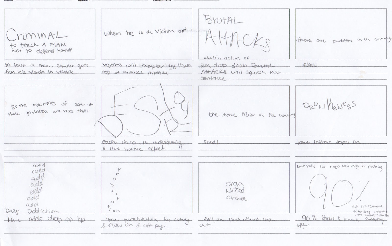
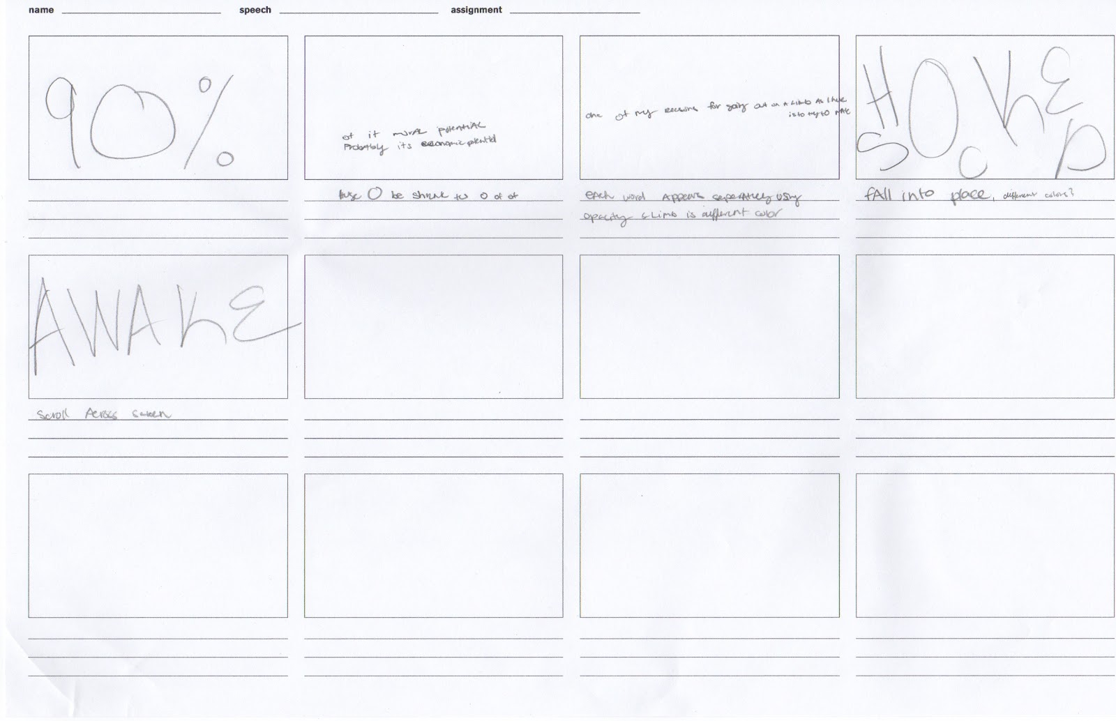
overall I really like how my book and movie cane together. I think the contrast between black and white really helped on the movie and the book. I think the book really has a good sense of movement especially on the pages, drukeness, drug addiction, and organized crime. the organization of the book makes it easy and clear what to look at while still presenting expressive type and showing a strong message. In regards to the video I am pretty happy with how that turned out as well. I like the fact that my book and video are very cohesive and how adding simple movements in the video adds to the message rather than trying to go overboards with the motion. One effect that I like that goes on throughout the whole video is how the black background moves to either cover up or uncover something new. I think its a really good way to transition and adds uniformity to the video without making it seem redundant.
Wednesday, February 20, 2013
Tuesday, February 12, 2013
inspirational video
Inspiration questions
North By Northwest
Psycho
Ocean’s Eleven
How does Saul Bass work with type, image/graphics and music in these three title openings to set the tone for the coming film? How do they play off of one another? What is the mood you feel watching them? How are they similar and different?
in oceans eleven title sequence saul uses the dots and continuous lines that show up in segments to be his items of consistency. the dots are always framing something. IN North by Northwest the grid lines are something that is consistent why the title sequence is going on another thing that is consistient is that the credits all slide in and out and they also use bars to connect the frames. Psycho was the most experimental of the type and the music has a different tone then the other two but again there are lines that make the frames uniform as well as the sliding on and off the screen of the credits. Another thing that happens in all of them is that the major movements in the motion graphic are aligned with the bars in the music.
I Shot Andy Warhol
Safe
American Psycho
How does Marlene McCarty work with type, image/graphics and music in these three title openings to set the tone for the coming film? How do they play off of one another? What is the mood you feel watching them? How are they similar and different?
in I shot andy Warhol the music is more serious . theres a little tremble motion to the words. everything is kind of choppy and it has gun sound at major parts during the title sequence. the music is ominous and uses the glow effect. the title sequence flows more versus being choppy American Psycho has a simpler approach the type doesn't really transition as much. The emphasis is more on the images than it is on the type. Out of the 3 videos you would thing its music would be the most ominous out of the 3 but it is the opposite.
malcolm X motion Graphics


This Motion graphic was one of my first exploration and it followed closely to the book I created. It uses a lot of big words and zooming in on them as well as making the words move in a way that shows what the words mean.
motion graphics2

this motion graphics I wanted to have a really simple feel so I focused on gradients and things coming either one sentence or phrase at a time. I also focused on it being more cohesive so things from a prior frame would end up on the frame your vewing.
motion graphics storyboard


Revised book based on critique


book revision 2


book revision number one

.jpg)
Monday, January 28, 2013
kinetic/expressive type

Created by: David Carson
This is a good example because it combines multiple techniques to get a point across but doesn't over do it to the point that your not able to grasp the concept. I think one of the most successful concepts is the light against the dark. ANother thing that draws my eye to it is that a lot of the black is created by overlapped words which I thought was really interesting and I also think that creating space between the letters was really successful.

Created by:Anush shaginian
This is a good example because it is simple and easy to read but the concept is still really strong and presents a nice visual
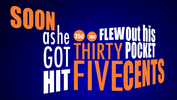
I like this example of kinetic type because of the variations of thick and thin as well as the scale of the words. I like that he put the 25 and 10 cents in circles in addition to writing out five cents to echo the way change looks I also like the way it helps gives a sense of motion with using depth of space.
Subscribe to:
Posts (Atom)