Wednesday, February 20, 2013
Tuesday, February 12, 2013
inspirational video
Inspiration questions
North By Northwest
Psycho
Ocean’s Eleven
How does Saul Bass work with type, image/graphics and music in these three title openings to set the tone for the coming film? How do they play off of one another? What is the mood you feel watching them? How are they similar and different?
in oceans eleven title sequence saul uses the dots and continuous lines that show up in segments to be his items of consistency. the dots are always framing something. IN North by Northwest the grid lines are something that is consistent why the title sequence is going on another thing that is consistient is that the credits all slide in and out and they also use bars to connect the frames. Psycho was the most experimental of the type and the music has a different tone then the other two but again there are lines that make the frames uniform as well as the sliding on and off the screen of the credits. Another thing that happens in all of them is that the major movements in the motion graphic are aligned with the bars in the music.
I Shot Andy Warhol
Safe
American Psycho
How does Marlene McCarty work with type, image/graphics and music in these three title openings to set the tone for the coming film? How do they play off of one another? What is the mood you feel watching them? How are they similar and different?
in I shot andy Warhol the music is more serious . theres a little tremble motion to the words. everything is kind of choppy and it has gun sound at major parts during the title sequence. the music is ominous and uses the glow effect. the title sequence flows more versus being choppy American Psycho has a simpler approach the type doesn't really transition as much. The emphasis is more on the images than it is on the type. Out of the 3 videos you would thing its music would be the most ominous out of the 3 but it is the opposite.
malcolm X motion Graphics


This Motion graphic was one of my first exploration and it followed closely to the book I created. It uses a lot of big words and zooming in on them as well as making the words move in a way that shows what the words mean.
motion graphics2

this motion graphics I wanted to have a really simple feel so I focused on gradients and things coming either one sentence or phrase at a time. I also focused on it being more cohesive so things from a prior frame would end up on the frame your vewing.
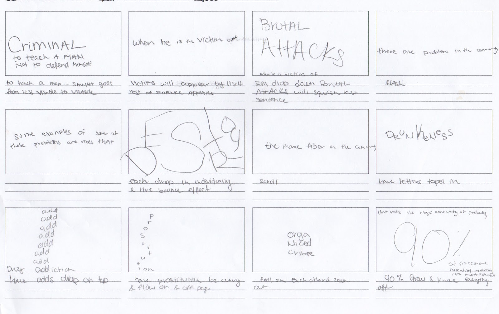
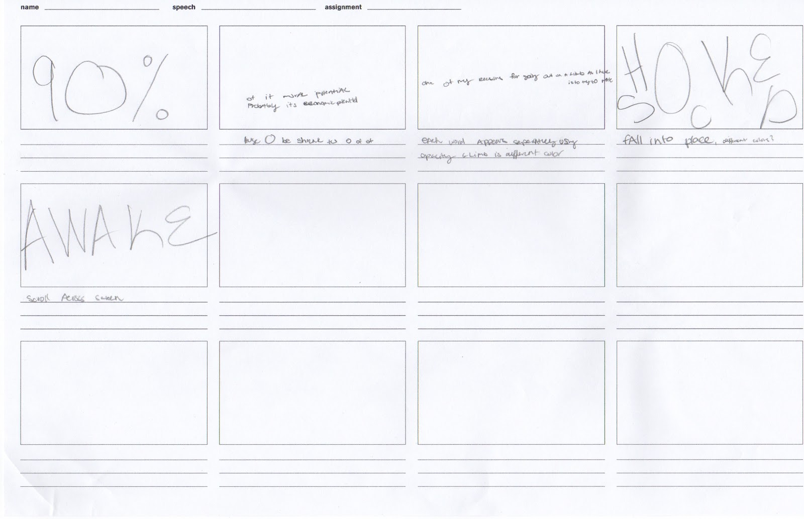
motion graphics storyboard


Revised book based on critique


book revision 2


book revision number one

.jpg)
Subscribe to:
Comments (Atom)